Many traders excel at data collection, diligently filling their trade journaling apps, spreadsheets, or notebooks with every detail of their trades. However, the problem lies in what happens next. Often, no review, reflection, or insight is gained from this data, rendering the collection process futile.
Here’s the catch: data without analysis is just noise.
What if you could see your performance patterns at a glance instead of staring at endless rows of trades? Imagine instantly spotting your most profitable setups, identifying timeframes that consistently sabotage your results, or realizing your risk appetite shifts every Friday afternoon.
Enter the power of data visualization. This tool allows you to see your trading performance patterns at a glance, instantly spotting your most profitable setups, identifying consistent timeframes that affect your results, and even recognizing shifts in your risk appetite.
With a well-designed trading dashboard, you don’t just collect information—you transform it into actionable insight. Using visual analytics, you can decode your trading behavior, track emotional patterns, and confidently make smarter decisions.
This isn’t about pretty graphs. It’s about making your trading data speak, visually, and usefully.
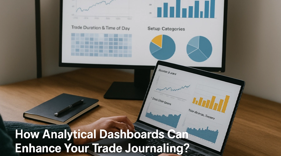
This article will delve into the transformative power of analytical dashboards, turning your trade journal into your most potent trading tool.
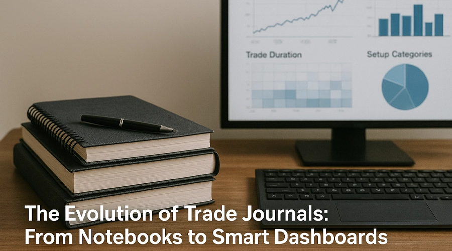
The Evolution of Trade Journals: From Notebooks to Smart Dashboards
Trade journaling isn’t new. The most disciplined traders have always kept records—some scribbled in notebooks, others organized in complex Excel sheets. But here’s the shift: logging trades is no longer enough. The modern trader demands more than rows of numbers—they want insight, clarity, and speed.
Enter the era of analytical dashboards.
These aren’t just upgraded spreadsheets. A good trading dashboard offers a dynamic view of your performance using data visualization tools like line charts, bar graphs, heatmaps, and interactive timelines. It helps you go from asking, “What happened?” to answering, “Why did it happen?”—and more importantly, “How can I improve it?”
This evolution mirrors a broader movement in decision-making: from passive documentation to active optimization. It’s not just about recording your trades anymore, it’s about actively using that data to improve your trading strategies. This shift can make you feel more engaged and proactive in your trading.
By shifting from static records to visual performance snapshots, you start seeing the bigger picture. This newfound understanding often reveals things you would’ve missed in plain text—like how your win rate changes with market conditions, or how your emotional state influences your stop-loss discipline. This empowerment from understanding your own patterns can boost your confidence and control in trading.
In its modern form, trade journaling isn’t about writing down trades. It’s about designing a visual system that helps you make better ones.
Chat with our AI chatbot and make informed trading decisions in seconds.
What is Data Visualization—and Why Should Traders Care?
Let’s clear one thing up—data visualization isn’t about making your trading journal look pretty. It’s about turning raw numbers into visual insights that your brain can process faster, easier, and more intuitively.
Data visualization represents data through graphical elements like charts, graphs, and heatmaps. But in the context of trade journaling, it becomes much more powerful. Why? Because it bridges the gap between raw data and real behavior.
Imagine trying to analyze a hundred trades by scrolling through a spreadsheet. Imagine seeing your win-rate trend as a line graph or your risk-reward distribution as a colorful bar chart. Which one is more likely to reveal a pattern? Exactly.
This is where visual analytics shines. They allow traders to:
- Instantly spot inconsistencies in strategy
- Identify which setups are profitable.
- Detect behavioral patterns, like overtrading after losses or chasing trades late in the day.y
Most importantly, data visualization removes emotion from the equation. When you’re looking at graphs instead of isolated trades, it’s easier to stay objective. You’re not just “remembering” how that one losing trade felt—you’re analyzing performance across time, setups, and risk levels.
In a fast-paced world where milliseconds matter, the ability to interpret your journal visually isn’t just helpful—it’s essential.
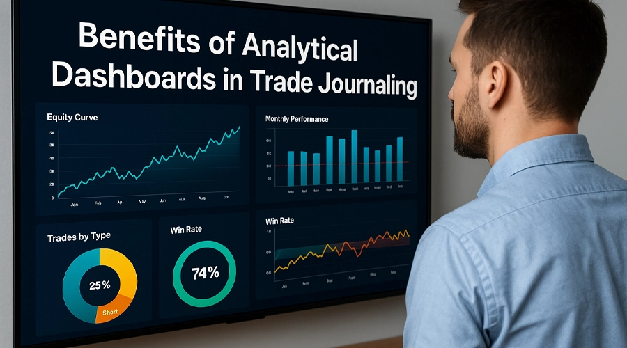
Benefits of Analytical Dashboards in Trade Journaling
A well-structured analytical dashboard isn’t just a cool interface—it’s a game changer. When you combine the discipline of trade journaling with the clarity of data visualization, you unlock a deeper level of self-awareness and strategic refinement.
Let’s break down how trading dashboards give you a competitive edge:
Spot Patterns Instantly
Why waste time digging through raw data when a chart can show you that 70% of your winning trades happen on Wednesdays—or that your setups perform best during trending markets? With visual analytics, trends jump at you, saving you hours of guesswork.
Understand Emotional Triggers
Pair your trades with mood logs and use data visualization to track how your emotions affect outcomes. You might find that trading after a stormy night’s sleep consistently leads to poor decisions. A dashboard can make those subtle patterns obvious.
Accountability in Action
Numbers can lie. Charts rarely do. A streak of over-leveraged trades, frequent break-even exits, or repeated violations of your risk rules becomes visually undeniable when displayed as graphs. This level of transparency keeps you accountable.
From Guessing to Strategizing
Without a dashboard, many traders make changes based on gut feelings. With one, you make decisions based on facts. You can visually test adjustments—like changing your stop-loss distance or altering entry conditions—and see how it affects your overall equity curve.
Confidence Through Clarity
Nothing beats the confidence of knowing your system works, because you can see it. When your data is visualized, you trust your plan more. You stick to it. And that consistency is where long-term profitability lives.
In short, analytical dashboards don’t just help you track your trades. They allow you to become a more intelligent trader.
The Psychology Behind Visual Data: Why It Hits Differently
There’s a reason why your brain lights up when it sees a graph instead of a spreadsheet: visuals speak a language your mind understands instantly. Studies show the human brain processes images up to 60,000 times faster than text. That’s not a fun fact—it’s a trading edge.
When you use data visualization in your trading dashboard, you’re not just organizing information. You’re shaping the way your brain interacts with that information. You’re creating a feedback loop that’s both efficient and emotionally resonant.
Here’s why it matters:
Visuals Trigger Emotional Recognition
Seeing your equity curve dip after a streak of poor trades hits harder than reading “-3%” in a cell. Visual analytics don’t just show the numbers—they make you feel them. This emotional resonance with your trading data can lead to more impactful behavioral change, making you feel more connected to your trading decisions.
Patterns Become Stories
Your brain loves patterns, but it remembers stories. A graph showing how your trades suffer after 3 p.m. tells a story your brain won’t forget. This transforms raw data into a narrative, and narratives stick.
You Build Self-Awareness Without Judgment
When your performance is visualized, you observe it more objectively. You do not label trades as “good” or “bad”—you simply see how your system performs over time. This helps remove ego and promotes continuous learning.
Reinforcement Through Repetition
Consistently seeing the same trends reinforces habits. When your trading dashboard shows that specific setups work better than others, you will likely stick to them. Repetition builds trust, and trust leads to consistency.
In short, visual data speaks to both logic and emotion. And that’s exactly what traders need: decisions grounded in analysis but aligned with discipline.
Step into smarter trading with Master the Market.
Join ARYAMERX and turn market chaos into calculated moves.
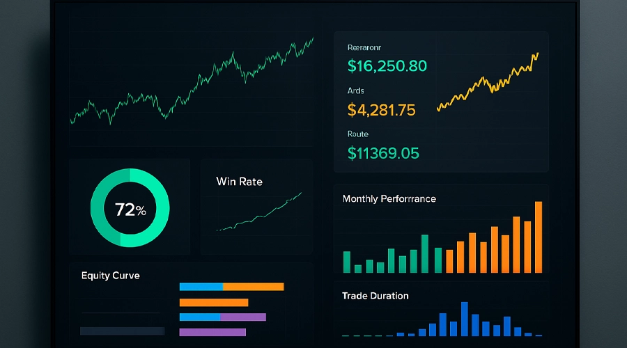
What to Track (and Visualize) in Your Trading Dashboard
Not all data is created equally, and not everything needs to be visualized. The key is to track what matters most to your trading style and present it in a format that reveals insight, not clutter.
Here are the core metrics and visual elements you should consider integrating into your trading dashboard for optimal clarity and performance:
🔹 Win Rate Over Time
A line graph tracking your win/loss ratio over weeks or months can show whether your edge is improving or eroding. It’s one of the clearest indicators of performance trends.
🔹 Risk-Reward Ratios
Use bar charts or scatter plots to visualize how much you risk vs. how much you earn. This instantly reveals whether you’re risking too much for too little reward—or vice versa.
🔹 Trade Duration & Time of Day
Do your trades perform better in the morning or afternoon? Are longer holds more profitable than quick scalps? Heatmaps or time-distribution charts can help you determine this.
🔹 Setup Categories & Strategy Performance
Group trades by setup (e.g., breakout, pullback, trend continuation) and compare their outcomes using pie charts or stacked bar charts. This helps you double down on what works.
🔹 Market Conditions & Volatility
Overlay your trades with market context—was it a trending day? Was it high volatility? This adds meaning to outcomes and helps refine entries. Consider timeline-based visualizations.
🔹 Equity Curve
The classic equity curve is a must. It shows your account growth (or drawdown) over time and, when reviewed regularly, provides emotional grounding.
Pro Tip: Keep it Focused
Avoid the temptation to track everything. An overloaded dashboard becomes noise, not insight. Stick to 5–7 visual metrics directly tied to your decision-making process.
A good data visualization strategy doesn’t overwhelm—it empowers.
How to Build or Choose the Right Dashboard
So, you’re convinced that a visual trading dashboard can change the way you trade. But where do you start? Should you build one yourself or use a ready-made tool? The good news is: there’s no one-size-fits-all—only what fits you.
Let’s break it down:
Option 1: Spreadsheet-Based Dashboards (DIY Style)
If you’re comfortable with Excel or Google Sheets, you can build a custom data visualization system from scratch. Use formulas, conditional formatting, and plugins (like Google Data Studio or ChartExpo) to create a personalized dashboard tailored to your metrics.
✅ Pros: Total control, customizable
❌ Cons: Time-consuming, steep learning curve if you’re not data-savvy
Option 2: No-Code Dashboard Platforms
Tools like Notion, Airtable, or specialized trading journal platforms often offer built-in charts, analytics, and visual analytics features. These are great for intermediate traders who want visual clarity without getting lost in the weeds.
✅ Pros: Fast setup, user-friendly
❌ Cons: Limited customization, may not support all trading styles
Option 3: AI-Powered Journaling Tools
Modern platforms now offer intelligent dashboards that go beyond tracking—they interpret. Using AI, they highlight trades that deviate from your average behavior, auto-tag setups, and even surface patterns you didn’t know existed. These tools elevate data visualization by combining it with real-time learning and feedback.
✅ Pros: Smart insights, effortless analysis
❌ Cons: Still evolving, may feel like a black box for some
💡 Want to experience AI-powered journaling in action?
Try Journalio—your intelligent trade companion.
With Journalio, you don’t just log trades. You get instant feedback, pattern recognition, behavioral insights, and tailored suggestions—all through intuitive visual analytics. Whether a beginner or a seasoned trader, Journalio adapts to your journey and helps you trade smarter, not harder.
👉 Get started with Journalio today and let AI become your trading edge.
Key Tips for Choosing or Building Your Dashboard:
- Keep it visual, not cluttered: Simplicity wins.
- Align it with your strategy: Swing traders need different visuals than scalpers.
- Make it part of your routine: If you don’t look at it, it’s useless.
- Use color with purpose: Red for risk, green for gains—make it intuitive.
- Review weekly, not yearly: Dashboards are about regular feedback, not annual audits.
Common Mistakes: When Data Visualization Goes Wrong
While data visualization can be a powerful tool in your trading arsenal, misusing it can lead to confusion, distraction, or worse, false confidence. Like with any tool, it’s not about how flashy it looks but how well it works.
Here are the most common mistakes traders make when using analytical dashboards:
Mistake #1: Visual Overload
A dashboard with too many charts, colors, and metrics becomes overwhelming. If you need a roadmap to read your data, it’s not helping. Keep your visuals clean, minimal, and aligned with what you use in decision-making.
Mistake #2: Tracking Vanity Metrics
Not every number is meaningful. Just because you can track something doesn’t mean you should. Focus on metrics that directly impact your profitability and performance, not impressive ones.
Mistake #3: Misreading the Data
A downward trend in one chart doesn’t always mean failure. Correlation isn’t causation. Traders often jump to conclusions from visual patterns without proper context. Always combine visual analytics with critical thinking.
Mistake #4: Ignoring Outliers
One significant loss or win can skew your entire chart. Use filters or notations to identify outliers and prevent them from distorting your data’s story.
Mistake #5: Reviewing Too Late
You’re missing the point if you only look at your trading dashboard once a month. These tools are meant for regular feedback loops. Weekly reviews help you spot issues early, when they’re still fixable.
✅ The Fix: Be Intentional
Good data visualization doesn’t just decorate—it educates. Approach your dashboard with clarity, purpose, and simplicity. The goal isn’t to impress yourself—it’s to improve yourself.
Conclusion – Making Your Journal Work for You
Journaling isn’t just about documenting trades—it’s about learning from them. And with the right tools, especially analytical dashboards and data visualization, your trade journal transforms from a passive log into a powerful decision-making engine.
When you start visualizing your performance, you stop trading in the dark. You begin to:
- Spot habits you didn’t know existed
- Make strategic adjustments with confidence.
- Detach emotionally and think objectively.
- Build consistency—your ultimate trading edge
But here’s the key: your dashboard is only as good as your discipline. It won’t magically improve your results unless you review it regularly, reflect honestly, and act intentionally.


